
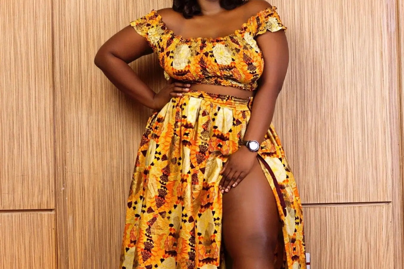




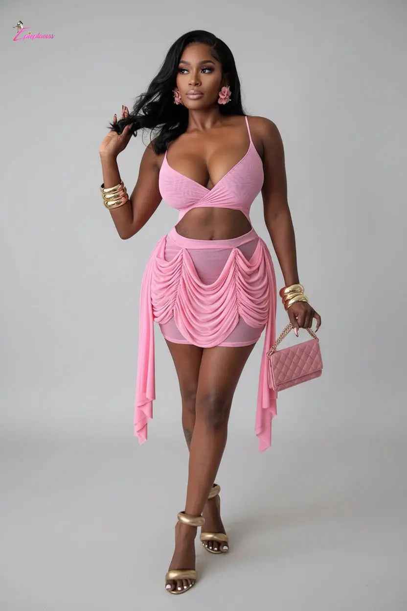

A resort wardrobe should look as good at golden hour as it does in the hotel lobby. This season’s resort wear color trends are made for exactly that: rich sunset shades, clean vacation neutrals, juicy brights, and soft tones that make every photo feel instantly elevated. Whether you are booking a beach getaway, planning a birthday trip, or building looks for poolside weekends, color is the quickest way to turn a simple outfit into a whole moment.
The Resort Wear Color Trends Making Every Getaway Better
The strongest vacation colors are not about following one strict palette. They are about choosing shades that match the setting, your energy, and the pieces you actually want to wear again. A bright swimsuit may be perfect for a girls’ trip, while a neutral matching set can take you from a late brunch to a sunset dinner with a change of shoes.
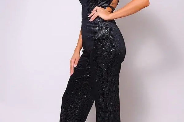
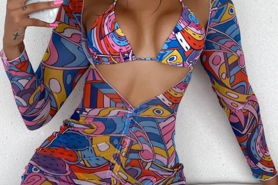
The best part is that these colors work across the pieces that make resort dressing easy: body-skimming dresses, breezy cover-ups, coordinated sets, wide-leg jumpsuits, swimwear, and statement accessories. Pick a shade that feels exciting, then let the silhouette do the rest.
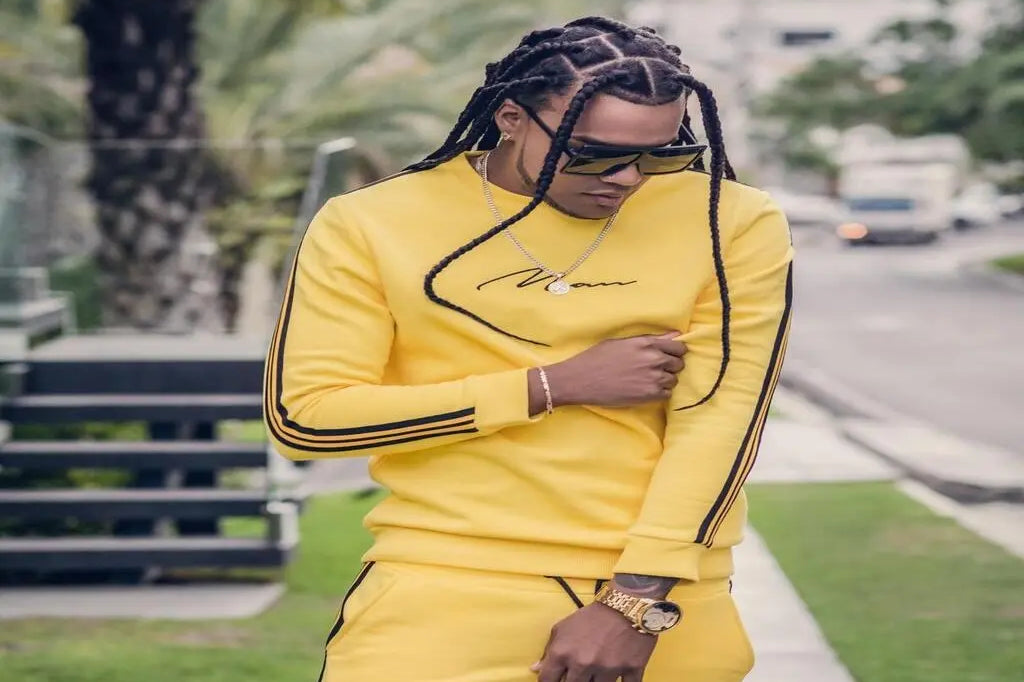
Butter Yellow Brings the Sunshine
Butter yellow is having a major vacation moment because it is softer than neon but still impossible to ignore. It has a sunny, expensive-looking feel that works beautifully in satin slip dresses, two-piece sets, crochet cover-ups, and swimwear. Think of it as the color you wear when you want a bright look without going full highlighter.
For daytime, pair butter yellow with white sandals, gold hoops, and a woven bag. At night, make it feel more polished with metallic heels and a compact shoulder bag. It also plays well with tan, cream, denim, and chocolate brown, so it is easier to rewear than you might expect.
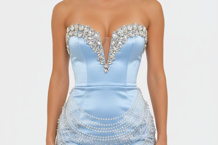
Ocean Blue Is the Easy Statement Shade
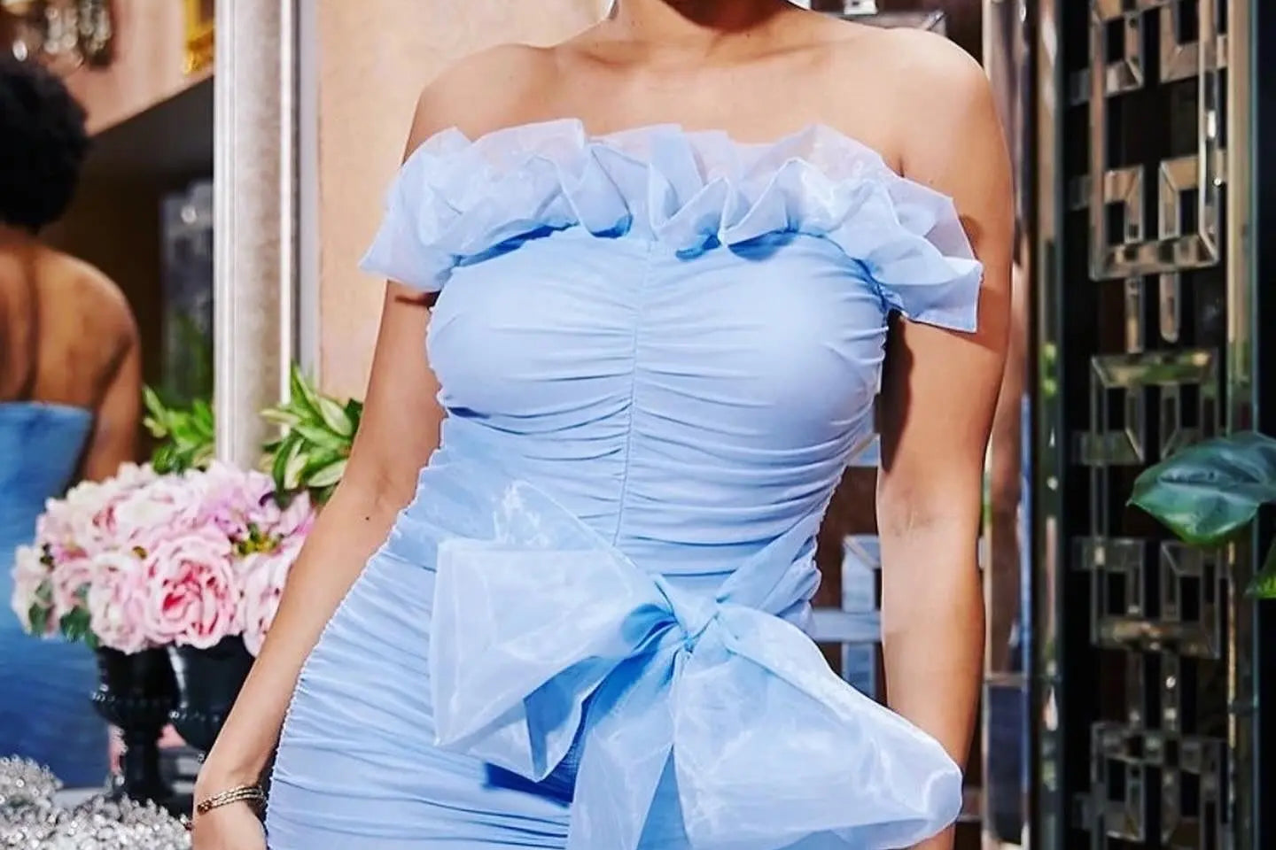
Blue always belongs in a vacation bag, but this season it is all about clear, water-inspired tones. Aqua, cobalt, turquoise, and bright cerulean bring immediate poolside energy to a look. They pop against sun-kissed skin and look incredible near white sand, resort pools, and tropical backdrops.
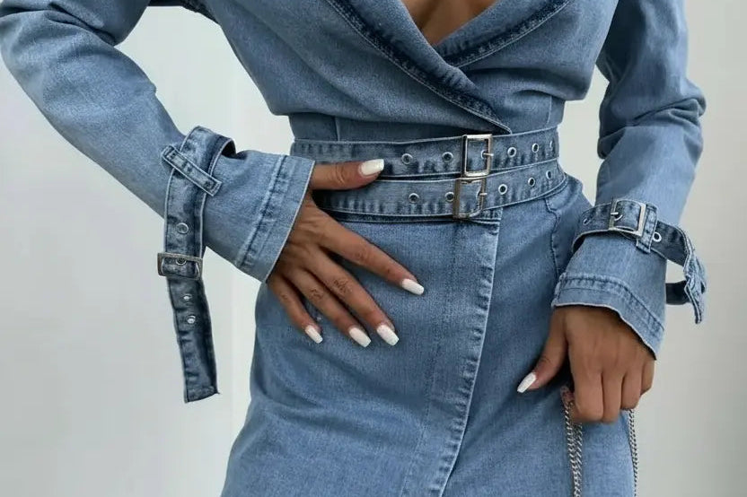
A bold blue cutout dress is made for a beach club reservation. A turquoise bikini with a sheer sarong feels fresh for the pool. If you prefer a more relaxed look, try an oversized blue button-down over swimwear with denim shorts. Keep accessories simple so the color stays the main character.
Tomato Red Turns Up the Heat
When the trip includes birthday dinners, rooftop drinks, or a night out by the water, tomato red is the move. It is warm, confident, and more playful than a deep wine shade. Red mini dresses, bodycon midi dresses, and fitted jumpsuits all deliver that ready-for-the-camera effect with very little styling effort.
This is also a smart color for shoppers who want one outfit to work hard. A red dress can be styled with strappy heels for dinner, then worn with flat sandals and a straw bag for a daytime event. Gold jewelry is the obvious match, but silver can give red a cooler, more nightlife-ready edge.
Tropical Green Feels Fresh, Not Basic
Lime, palm, pistachio, and vivid emerald are bringing fresh energy to resort style. Green is a standout choice for swimwear and matching sets because it feels playful while still looking fashion-forward. The exact shade matters: pale pistachio is soft and pretty, emerald feels sleek and dressy, and lime delivers maximum vacation confidence.
If a head-to-toe green outfit feels like too much, start with a green swimsuit, bikini top, handbag, or statement earring. A palm-green top with white denim shorts is an easy warm-weather formula. For an elevated dinner look, an emerald jumpsuit with gold accessories looks instantly put together.
Resort Wear Color Trends for a Softer Mood
Not every vacation look has to be loud. Soft colors are still a huge part of the resort edit, especially for daytime outfits, bridal trips, beach dinners, and polished travel days. The trick is choosing shades with warmth and depth instead of colors that disappear in bright sunlight.
Cream, Coconut, and Warm White
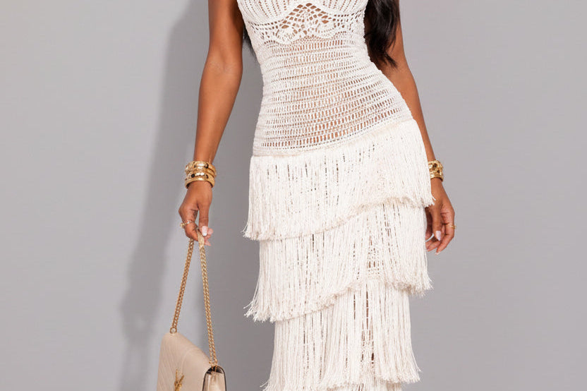
Cream is one of those shades that always looks like it belongs at a resort. It feels clean, elevated, and easy to style with nearly every color in your suitcase. A cream linen set, white maxi dress, or crochet cover-up can become the base for several outfits, especially when you switch up your shoes and jewelry.
Warm whites usually photograph better than stark white in intense sun. Look for ivory, coconut, ecru, or soft cream, then add texture through ribbed knits, eyelet, linen blends, fringe, or crochet. These details keep neutral outfits from feeling plain.
Blush Pink and Sunset Peach
Blush pink and peach are softer alternatives to the bolder red and orange family. They have a romantic, vacation-ready look that works especially well for flowy dresses, skirt sets, and feminine swimwear. Peach also brings out warm tones in gold jewelry, bronzed makeup, and neutral accessories.
These shades are ideal when the destination has a more relaxed, luxe feel. Picture a beachside dinner, a resort brunch, or a daytime celebration where you want to look dressed up without looking overdressed. Add a glossy lip, delicate jewelry, and a mini bag for a look that feels effortless but still special.
Chocolate Brown Is the New Vacation Neutral
Chocolate brown has moved far beyond fall wardrobes. On vacation, it feels rich, minimal, and unexpectedly glamorous, particularly in swimwear, fitted dresses, and sleek matching sets. It is a great option for anyone who loves neutrals but wants something deeper than black.
Brown pairs beautifully with cream, gold, butter yellow, turquoise, and animal-print accessories. A chocolate bikini with a sheer cream cover-up is an easy pool look. For evening, try a fitted brown maxi dress with bold gold earrings and barely-there sandals.
How to Wear These Colors Without Overpacking
A great resort wardrobe is not about bringing a different look for every hour. It is about packing colors that mix easily, then adding one or two pieces that make a statement. Start with one neutral foundation, such as cream, white, or chocolate brown. Add two bolder shades that fit your destination and plans, then bring accessories that work across everything.
For example, a suitcase built around cream, ocean blue, and butter yellow can cover beach days, travel outfits, daytime exploring, and dinner plans. A more nightlife-focused trip might call for chocolate brown, tomato red, and gold. The colors do not need to match perfectly. They just need to look intentional together.
Consider the fabric before committing to a color, too. Bright shades feel especially high-impact in glossy satin, stretchy swim fabric, and fitted ribbed knits. Neutrals look their best in texture-rich fabrics like crochet, linen, mesh, and lightweight knits. A color that feels basic in a plain tee can feel completely different in a cutout dress or an airy cover-up.
Build a Color-First Resort Outfit
If you are unsure where to begin, choose the item you want photographed most. Maybe it is a bright blue swimsuit, a red birthday dress, or a butter yellow matching set. Build from there instead of trying to make every piece equally bold.
For daytime, balance a statement color with neutral layers. A turquoise bikini looks polished with a white shirt and tan slides. For dinner, keep the outfit streamlined: a bold dress, one metallic accessory, and a shoe that does not compete. Matching sets are especially useful because they give you a complete look in seconds, but each piece can also be restyled with denim, swimwear, or a simple skirt later in the trip.
At Epicplacess, the most exciting vacation looks are the ones that feel current, confident, and easy to wear again. Go bold if that is your mood, keep it soft if you want an effortless glow, and leave space in your bag for the pieces you will want to wear the moment you get home. The right color does more than match the destination - it makes the whole trip feel like your style moment.